Enhance your Apple Watch experience by standardizing app icon sizes, making it easier and more intuitive to tap and navigate through your apps.
When you’re on the Apple Watch Home Screen looking at all your installed watchOS apps, you’ll notice that as you rotate the Digital Crown or scroll with one finger, the app icon sizes change as they get pushed off screen.
If you don’t like this behavior and want a more uniform app browsing experience, you can turn on the Reduce Motion feature, which will force all app icons to have the same size and be scrollable without extra animations. Just note that restricting the motion also disables other animations throughout the watchOS interface (more on this later).
Turn on Reduce Motion to stop Apple Watch app icons from changing their size
You can do this directly from your wrist or by using the companion Watch app on your iPhone.
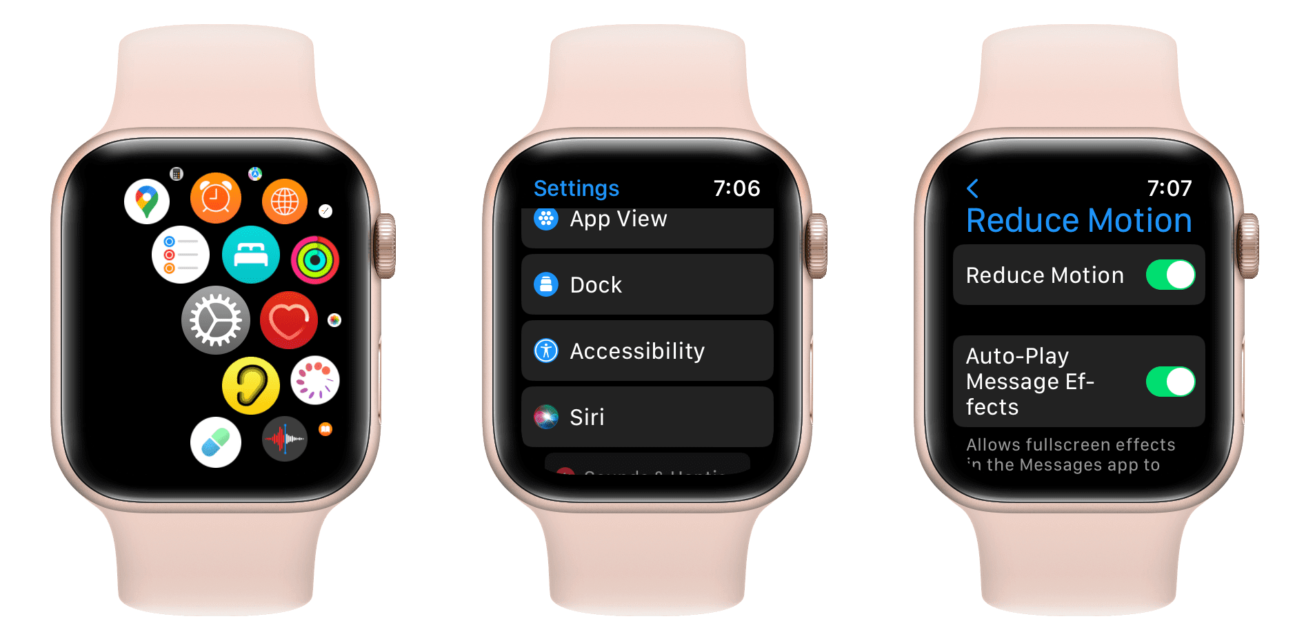
- Open the Settings app.
- Scroll down and tap Accessibility.
- Go down and tap Reduce Motion.
- Turn on the switch next to Reduce Motion.
As you might expect, you can also enable Reduce Motion from the companion app on your paired iPhone:
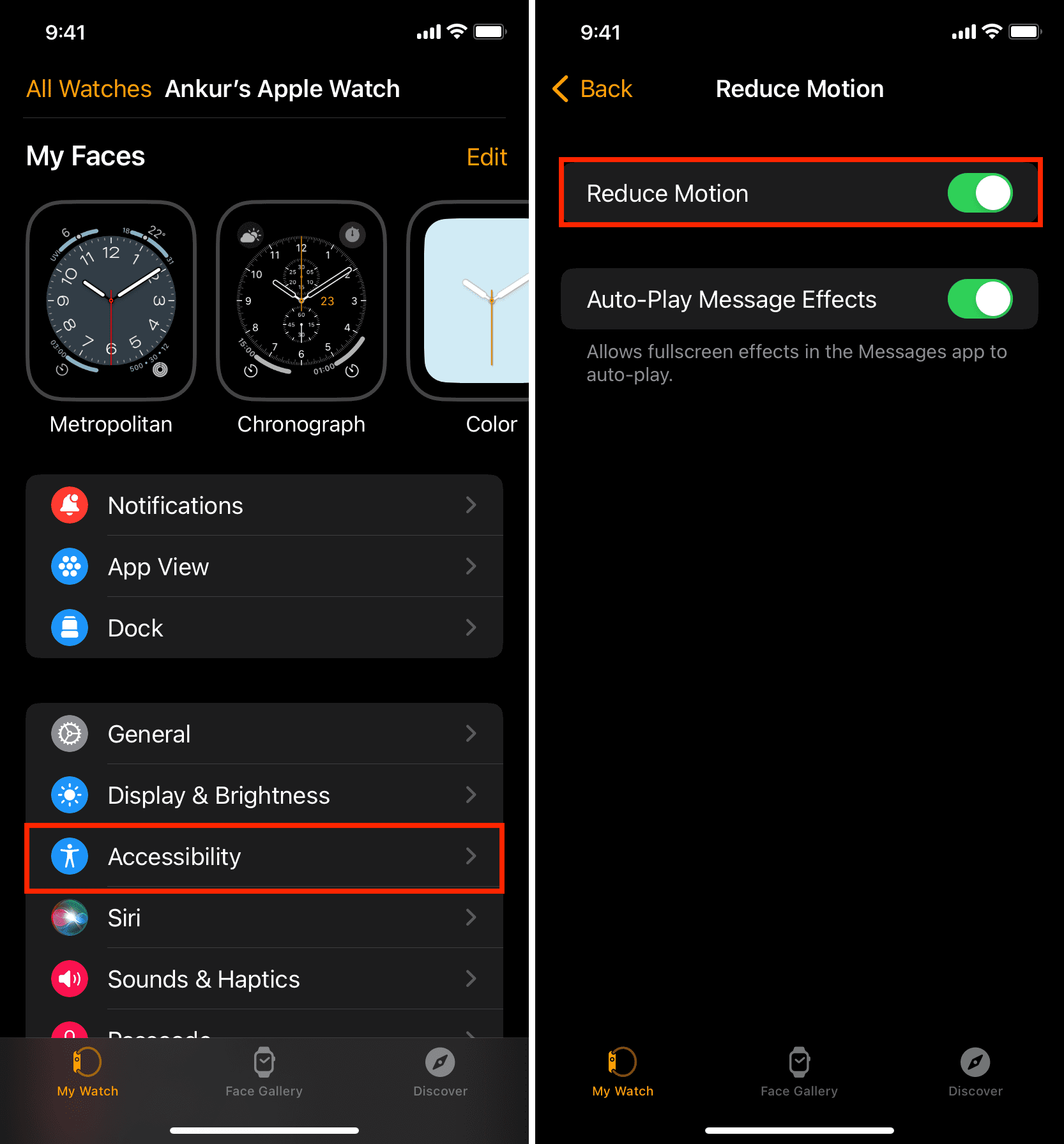
- Open the Watch app on your iPhone.
- Tap Accessibility from the My Watch tab.
- Tap Reduce Motion.
- Turn on Reduce Motion from the next screen.
Now press the Digital Crown to return to the app bubble. You’ll notice that all app icons are of the same size, making it easier to tap. On my 44mm Apple Watch, the icons look particularly large.
So, what exactly does Reduce Motion aim to accomplish? Here’s the official word from Apple:
Reduce Motion Limits animation and automatic resizing of the Apple Watch user interface on the Home Screen and when launching and exiting apps.
As you can see, the Reduce Motion feature on the Apple Watch is a bit different from the iPhone version of Reduce Motion. Since the Apple Watch Home Screen features different-sized app icons based on their location on the screen, this had to be incorporated into the Reduce Motion setting as well.
Like the iPhone, though, Reduce Motion also eliminates the motion-based animations when launching or closing apps or navigating inside apps. Instead of the complex animation, users see a simpler fade-in and fade-out effect.
The downside
Of course, there are trade-offs to enabling the Reduce Motion option, and you’ll need to consider these before fully committing to the setting.
First and foremost, you lose the sleek animations that occur when launching and closing apps. You might not think that’s a big deal, and I’d tend to agree with you, but you’re still missing out on some animations that Apple designers felt were important enough to include by default.
Perhaps more importantly, enabling Reduce Motion means fewer app icons may appear on the screen at once. Since all icons are the same size with Reduce Motion enabled, there’s less room to fit icons that would normally be placed around the edges of the interface due to their smaller size.
Compare this image below:
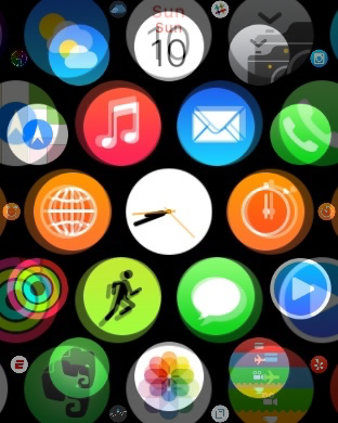
I’ve superimposed a Home Screen with Reduce Motion disabled alongside a screenshot with Reduce Motion enabled. You can clearly see some app icons that don’t appear on the screen with Reduce Motion on but do appear with it off. Notice the lack of Slack, Yelp, Drafts, ESPN apps, and others. Since you can easily launch those apps with small app icons using a normal tap—as seen in our video above—there is a difference here that must be considered.
After thinking it over, I think I’ll keep the Reduce Motion feature enabled on my Apple Watch. The uniform tap targets are just too good to pass up, even if it means more potential scrolling on the Home Screen to find the apps I need.
If this trade-off is unacceptable to you, I suggest moving from a grid-based app bubble layout to a simple list view.
More Apple Watch tips: